")
Mount Hermon, a towering natural landmark straddling Syria and Lebanon, is undergoing rapid climatic changes that threaten its delicate ecosystem. Once known for its snow-covered peaks and abundant water resources, the mountain is now experiencing shifts in temperature and precipitation patterns—an alarming consequence of global warming. The 2015 Paris Agreement aimed to curb global temperature rise to below 2°C, ideally 1.5°C, compared to pre-industrial levels. However, climate change is already altering landscapes worldwide, with Mount Hermon bearing visible signs of its impact.
Data sourced from Meteoblue, a weather and climate data platform, and ERA5, a global climate reanalysis by the European Centre for Medium-Range Weather Forecasts, reveals significant trends in the region from 1979 to 2021. While microclimates and local variations may differ, the broader picture is clear: temperatures are rising, and precipitation patterns are shifting.
A series of graphs illustrate these transformations. The first chart tracks the mean annual temperature, with a dashed blue line indicating long-term trends. If the line ascends, warming is intensifying; if it flattens, conditions are stable; if it declines, the area is cooling—though in Mount Hermon’s case, warming appears to be the prevailing trend. Another critical indicator is precipitation. The second graph presents an estimate of total annual precipitation. A rising dashed blue line suggests increasing rainfall, while a downward trend points to a drier future. In the lower section, “precipitation stripes” provide a visual representation of yearly fluctuations—green for wetter years, brown for drier ones. Together, these climate shifts paint a stark reality. Mount Hermon, historically a vital source of water and biodiversity, is at a crossroads. As temperatures climb and rainfall patterns change, the region’s ecological balance faces an uncertain future. The question remains: can proactive climate action help preserve this natural wonder before it’s too late?
Yearly Temperature Change
A set of graphs illustrates this change. The first chart estimates the average annual temperature for the Mount Hermon region, with a dashed blue line marking the long-term trend. If the line ascends, it confirms warming; if it remains flat, the climate has been stable; and if it descends, temperatures have cooled.
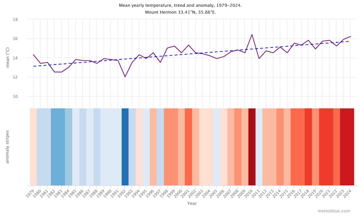
Below, the “warming stripes” visualization paints a striking picture—each stripe represents a year, with shades of blue indicating colder years and red signifying warmer ones. The shift from blue to red over time underscores an undeniable reality: Mount Hermon is heating up. This mountain, once known for its snow-capped peaks and vital water resources, now faces an uncertain future. As climate change intensifies, the question remains—how much longer can Mount Hermon withstand the heat?
Yearly Precipitation Change
The top graph presents an estimate of the average annual precipitation for the broader Mount Hermon region, offering insights into long-term climate trends. The dashed blue line represents the linear climate change trend. If this line slopes upward, it indicates increasing precipitation, suggesting a wetter climate in Mount Hermon. A flat line signals no significant change, while a downward slope points to a drying trend over time.
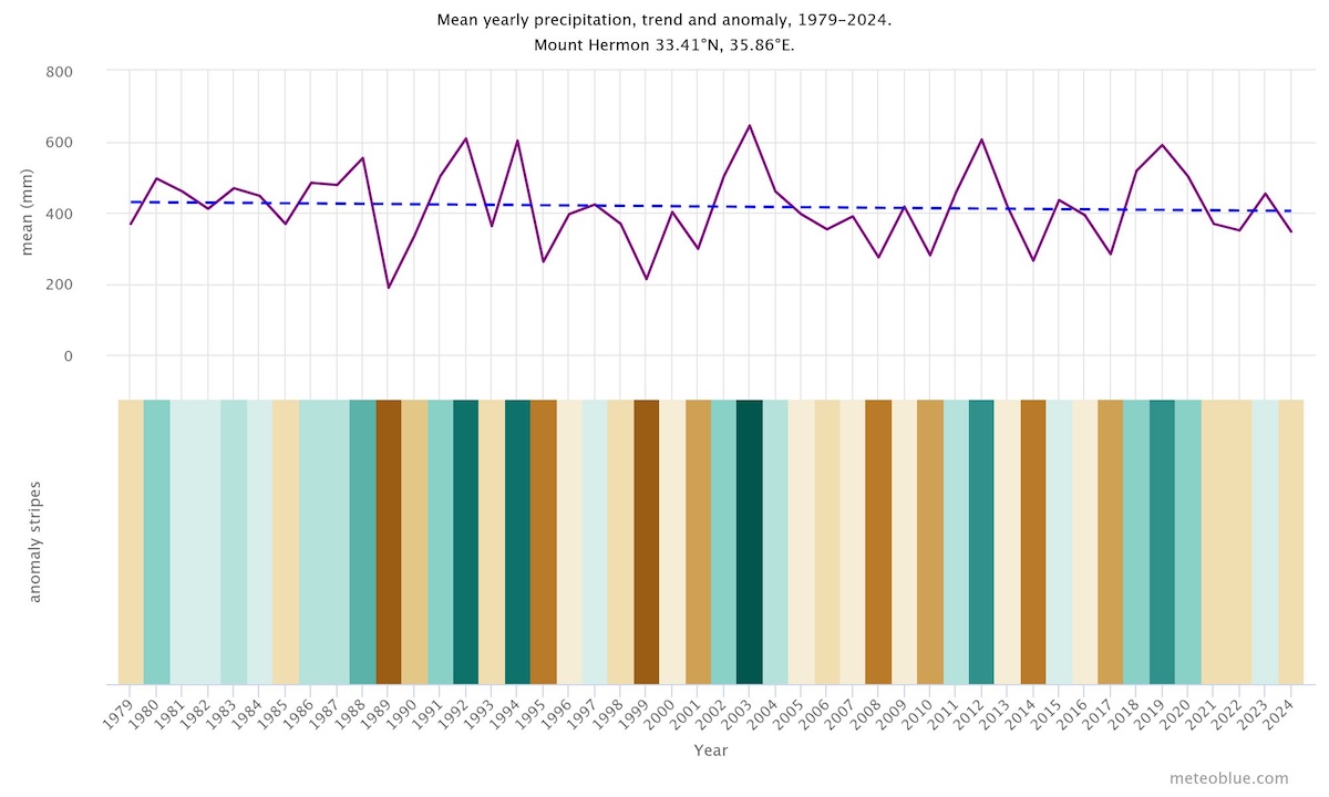
Below, the graph visualizes precipitation patterns through color-coded “precipitation stripes,” where each stripe corresponds to a year’s total rainfall. Shades of green represent wetter years, while brown hues highlight drier periods, painting a clear picture of Mount Hermon’s shifting climate.
Monthly Anomalies of Temperature and Precipitation
The top graph shows the temperature anomaly for every month since 1979 up to now. The anomaly tells you by how much it was warmer or colder than the 30 year climate mean of 1980-2010. Thus, red months were warmer and blue months were colder than normal. In most locations, you will find an increase of warmer months over the years, which reflects the global warming associated with climate change.
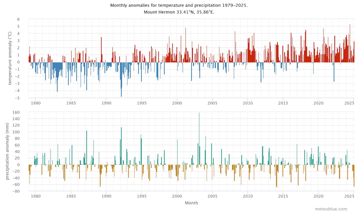
The lower graph shows the precipitation anomaly for every month since 1979 up to now. The anomaly tells you if a month had more or less precipitation than the 30 year climate mean of 1980-2010. Thus, green months were wetter and brown months were drier than normal.


